Case Study
Geoforce Track n Trace is an asset logistics and tracking platform that primarily gives industrial equipment providers insights into where their equipment is, and what it is doing. The web app was starting to show its age, with patched functionality and a UI that provided a disjointed work flow forcing them into other software solutions to completely manage their assets
We set out to rebuild the application in React, with an cleaner, modular UI that would allow us to both improve features and allow easy implementation of new ones, while making our users lives easier
1.) Better understand our users and their pain points, frustrations, and how they used the application in their day to day workflows
2.) Design, test and build workflows that would keep them in the application. Once we had a better understanding of how our users worked, we needed to redesign our application with their workflows and day to day tasks as our focus
01
Discovery started with us collaborating with our Customer Success reps and combing thru user feedback, where we were able to pull some recurring themes. We also gathered a pool of candidates who were willing to participate in further studies, where we ran unstructured interviews, asking them to share their screens and talk thru their day to day process, listening for oppurtutnies to make their lives easier.
We were also able to pull togther key insights into what their roles/titles and job duties looked like, which we used to start building personas and gathered insights into what different users needed depending on roles
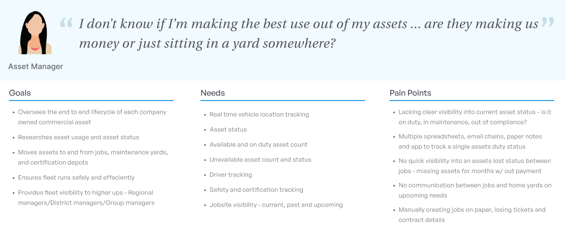
Building our user personas, we were able to clearly define some shared user needs and painpoints. It also gave us great insight into where our users felt our application was most lacking, and what features they would need to allow them to perform their day to day tasks on one platform
One big recurring theme came out - there was a gap between one of their biggest needs and what we offered. They needed to know not just WHERE their assets were, but what they were doing. 'Is my asset making me money' was a big point of interest for them
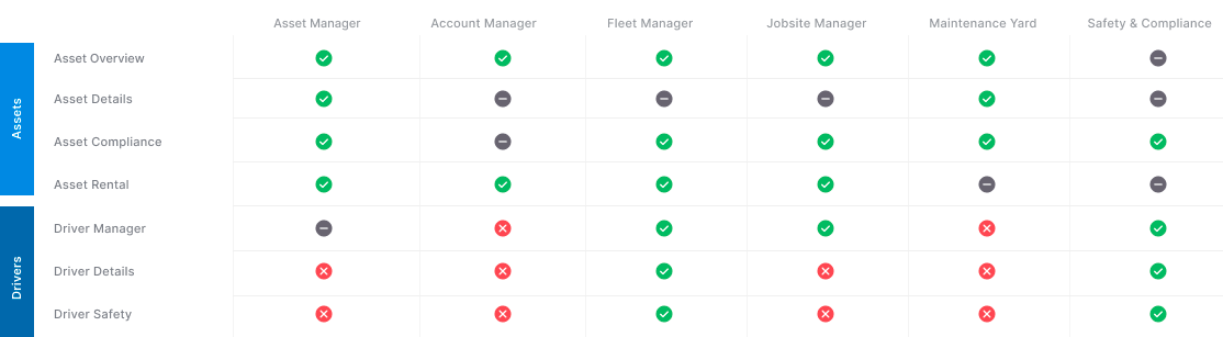
User interviews helped us build out persona types, and get an idea of what different parts of the applications they currently used, as well as what details they cared about. Depending on the size of the company, there was overlap in job roles between titles

We used a comprehensive set of tools to get a better idea of who our users were and what they were doing. Google Analytics and Hotjar gave us real time insights into how our users were currently working in our app, and dovetail allowed us to trascribe and document key findings from user interviews
02
Discovery started with us collaborating with our Customer Success reps and combing thru user feedback, where we were able to pull some recurring themes. We also gathered a pool of candidates who were willing to participate in further studies, where we ran unstructured interviews, asking them to share their screens and talk thru their day to day process, listening for oppurtutnies to make their lives easier.
We were also able to pull togther key insights into what their roles/titles and job duties looked like, which we used to start building personas and gathered insights into what different users needed depending on roles
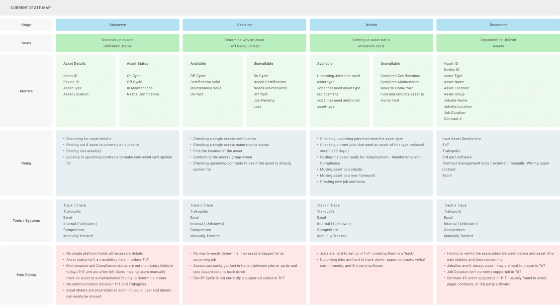
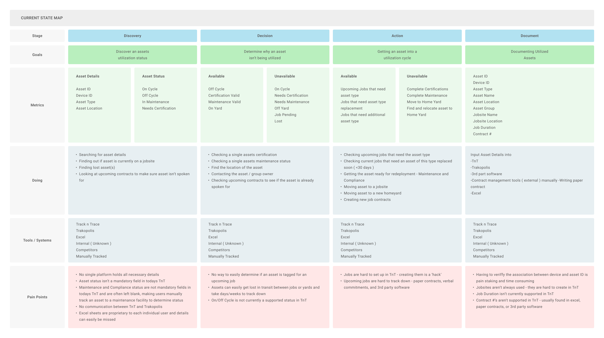
Mapping out the current state a user would go thru to determine the status of their asset and prepare it for utilization helped us visualize all the touchpoints, tools used and pain points our users would go thru in our current process
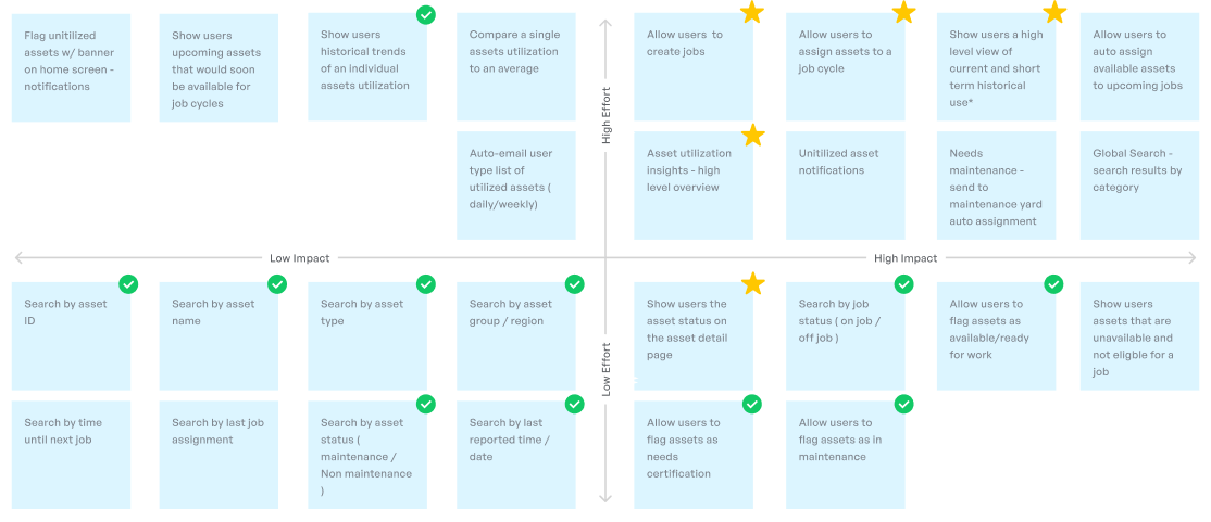
Before we moved to building out wires, we built a feature list - working with development and stakeholders to look at where we could add value, and determined what the effort would be from development. We worked to find both the low hanging fruit - easy to implement, high value features as well as the 'must have' elements that would allow our users to do their job effectively
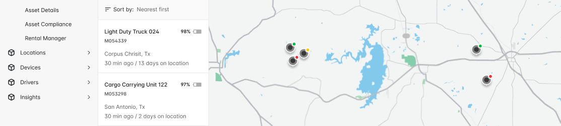
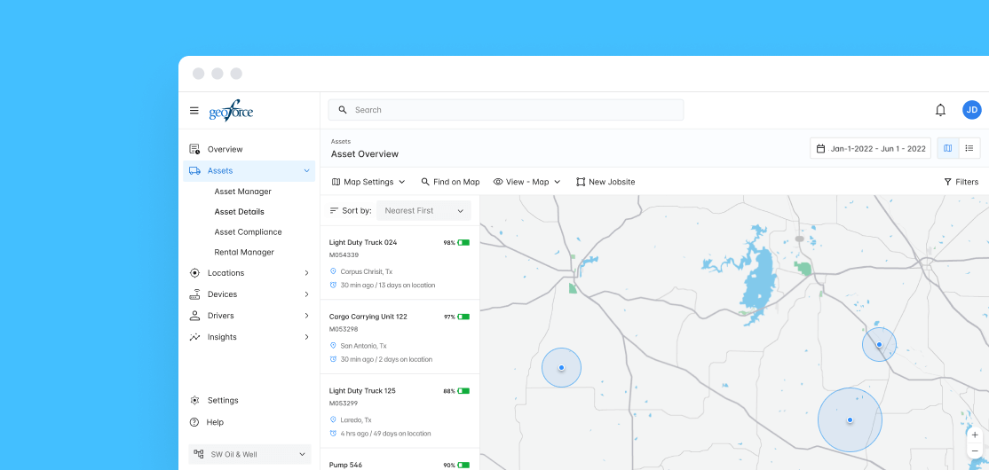
Taking the exisiting map view we had, we built on it - bringing in a sortable asset list, and using pin markers to denote asset status. This receieved mixed feedback - our legacy app let users chose both pin and marker colors, and some of them used them to track their own specific metrics at a glance
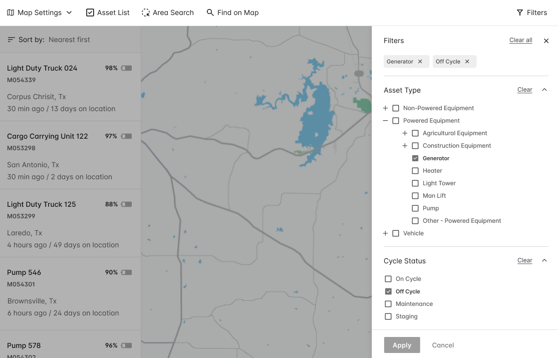
Introducing a global filter set was much better received during testing, with users easily able to sort by asset type, status, location, and more
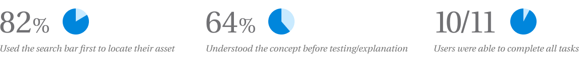
After our first round of testing, we saw mixed but positive results. Enough users confirmed they understood the concept of utilization before we explained it, and their mental model matched ours. Users were easily able to find their asset quickly, although most used the global search as the pathway to do so. During our testing, 10 of our 11 users were able to complete the tasks - finding an asset, determining its job status, and assigning it to a jobsite - with no coaching
We iterated off our first round of testing, explored the concept of utilizing an asset to a job, and built job creation flows before moving into high fidelity and MVP development
03
The next step was to take our insights and feedback from testing and translate them into high fidelity mockups ready for handoff. While our first iteration for release would be focused on putting a new updated navigation shell around our current UI, we wanted to build out the entire experience at once
Our new design focused on a more intuitive navigation, powerful on page filtering, and a feature rich map that gave our users more visibility into where their assets were, what they were doing, and how to best manage them
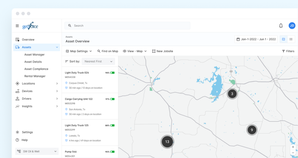
A refined jobsite overview showed not just the current or upcoming jobsites, but also the number of assets - and when filtered, exactly what assets - were on site
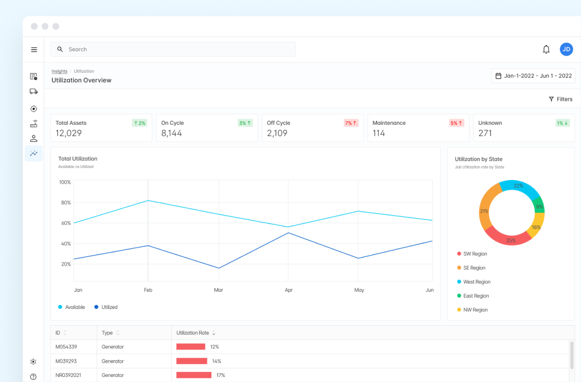
The concept of Utilization carried over into our updated Insights & Reports features, where we were able to provide a high level view, measurable over time, of what their assets were doing, along with trends and breakdowns by divisions, type, and location
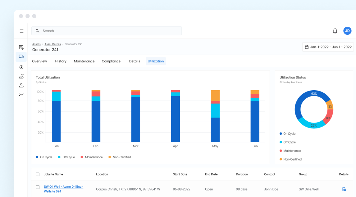
Digging deeper into an individual asset, you could measure it's total utilization, time on cycle, in maintenance, or sitting idle. A time sorted table gave quick insight into the job history of the specific asset
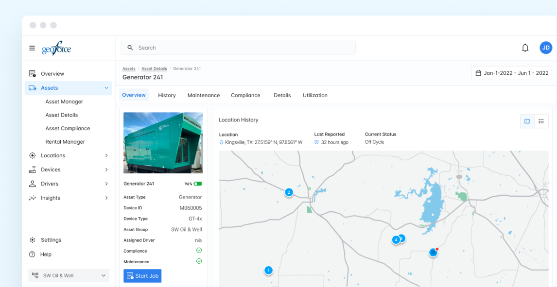
A refined asset detail page allowed users to view/edit asset details, see current and previously reported locations, and even assign an asset to a job
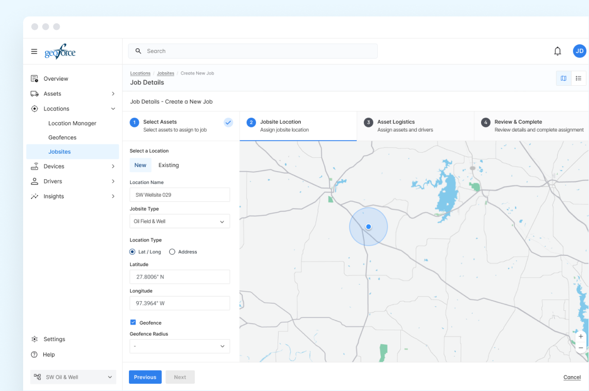
One of the features that evolved out of the utilization concept was a stepped 'Create a New Job' page where users could upload jobsite and contract details, assign or edit assets, and build out jobsite details and geofences in a streamlined process
04
Once designs were stable, we handed off directly from Figma into Zeroheight, where specs, tokens, and components from our design system lived. This gave devs a clean reference without back-and-forth guesswork — layouts, spacing, and behavior were all mapped.
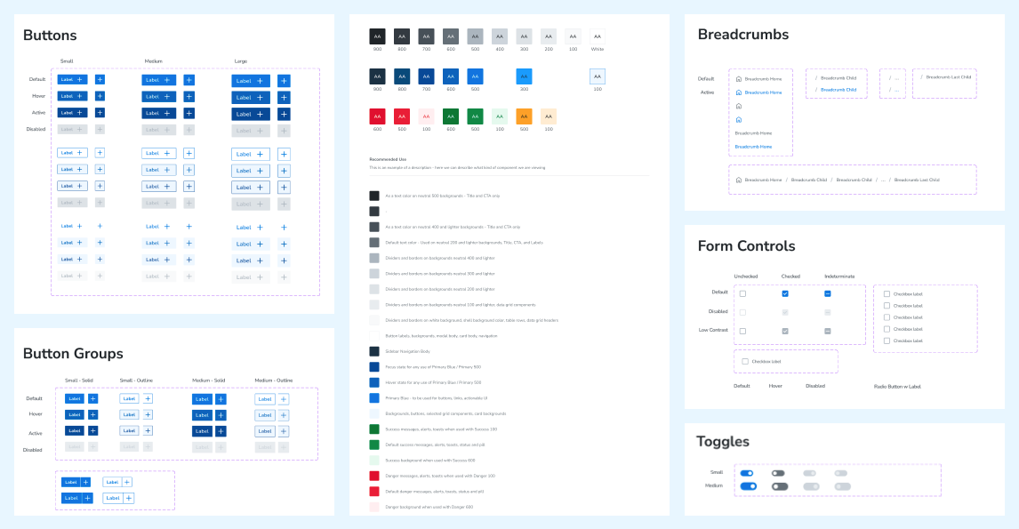
Snapshot of our design system living in Figma
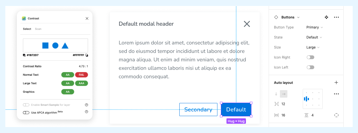
We made sure contrast and accessibility weren’t an afterthought — every token and component in the system was built to hit WCAG compliance out of the box
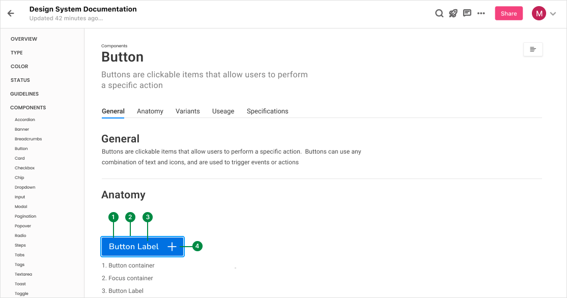
Labeling and tokens inside Zeroheight made life easier for devs — everything was spelled out, no guesswork required
05
Rebuilding Geoforce Track n Trace gave industrial equipment providers a cleaner, more usable platform for tracking not just where assets were, but what they were doing. By focusing on utilization and job workflows, we moved the product from a patched-together tool into something that could actually support end-to-end asset management.
Our design system and Zeroheight process kept the dev handoff steady — layouts, tokens, and behaviors were documented, so engineers could build without guesswork. The launch wasn’t flawless, but the baseline was solid and set the stage for faster iteration going forward.
What stood out:
Users wanted insight, not just maps. Visibility into utilization (earning, idle, maintenance) was a breakthrough feature
Customization vs. consistency was tricky. Some missed the freedom of custom map markers, but we prioritized clarity and standardization
Testing validated direction. 10 of 11 users completed key flows (find asset, check status, assign to job) without coaching