Case Study
Finance Data Hub was our answer to a messy reporting world — one place where Walmart Finance teams could find the right numbers, trust them, and actually use them. The goal was simple: pull metrics, dashboards, and data sources into a single platform with role-aware access and consistent definitions across the board.
Before FDH, things were all over the place:
1.) Thousands of stray Power BI reports — many with conflicting formulas
2.) No single source of truth — picking the “right” number was guesswork
3.) Painful access process — getting a report often meant chasing someone down
4.) Analysts stuck on ad-hoc requests — reconciling basics instead of delivering insights
It slowed decisions, eroded trust in the data, and made even simple questions way harder than they needed to be. FDH’s job was to kill the chaos and give everyone — from analysts to execs — one place to go for the numbers that matter.
01
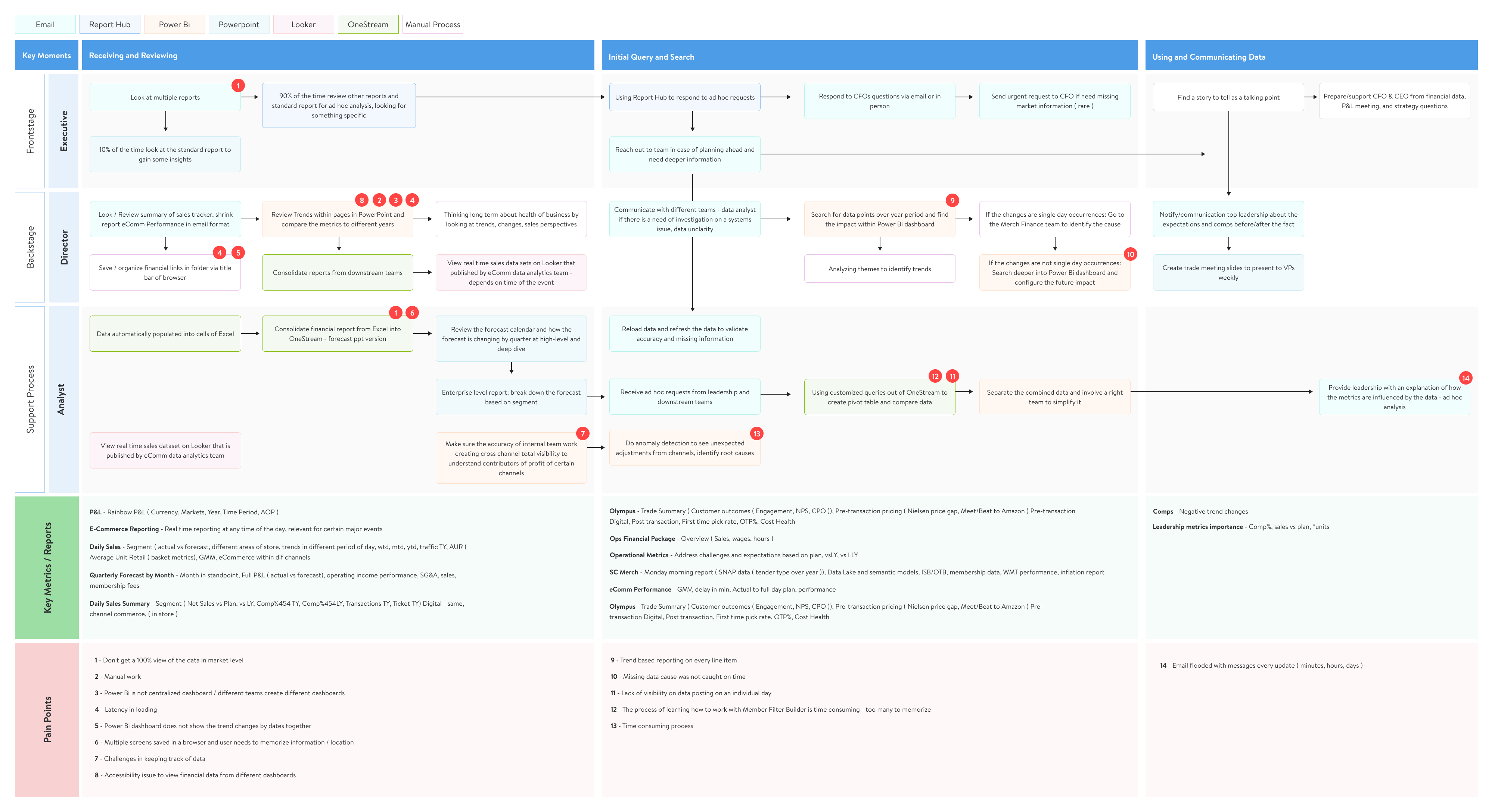
We conducted a series of deep-dive sessions and collaborative mapping workshops across Walmart Finance (Walmart US, Sam’s Club, and Intl) to understand the reporting pain points from executives, directors, and analysts
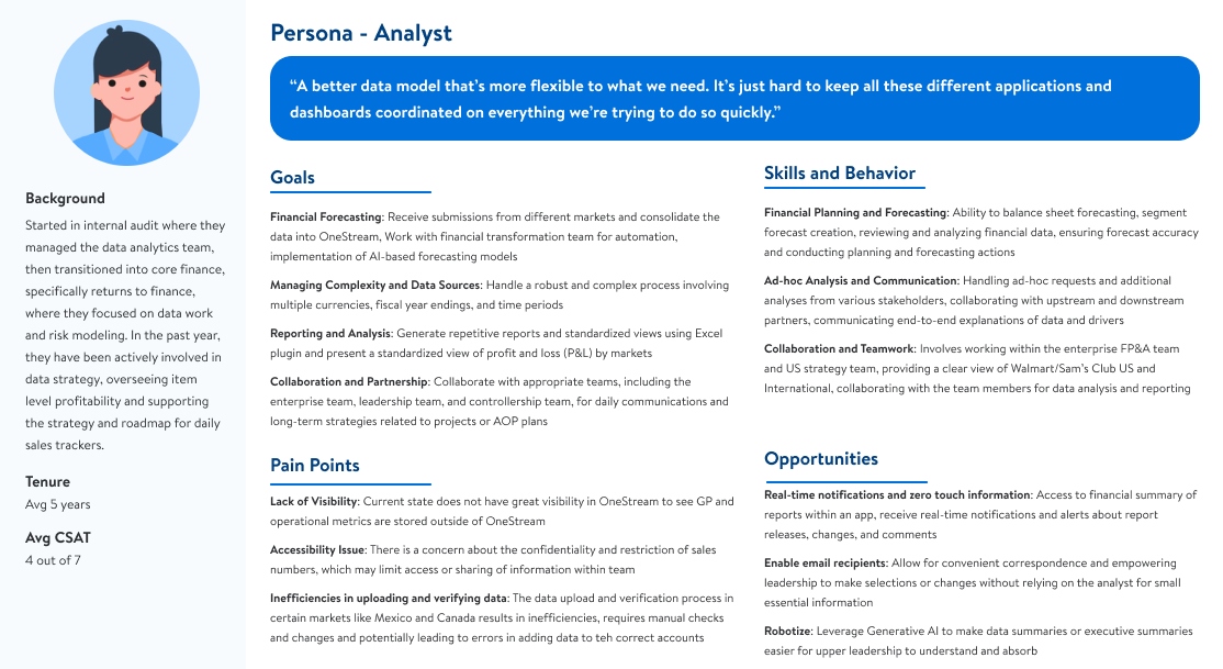
We built out detailed personas—like the Financial Analyst—to keep our solution tied to real user needs. Analysts needed to generate repeatable reports with clear P&L visibility by market, collaborate smoothly across entities and upstream teams, and cut through the complexity of juggling currencies and fiscal years. But the reality was rough: visibility in OneStream was low, data access was gated, and analysts were stuck manually validating reports
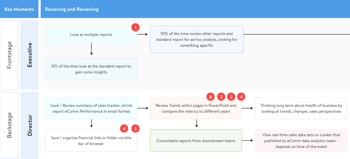
We created a day-in-the-life journey map across roles—from high-level execs to boots-on-the-ground analysts—to expose bottlenecks in the reporting pipeline. Analysts were patching gaps with Excel and juggling browser tabs just to stitch together a complete view. Directors were buried in multiple report formats—PowerPoint, OneStream, email digests—without time to validate trends. Executives had it worse: no single place to trust, relying instead on daily email blasts or last-minute analyst requests
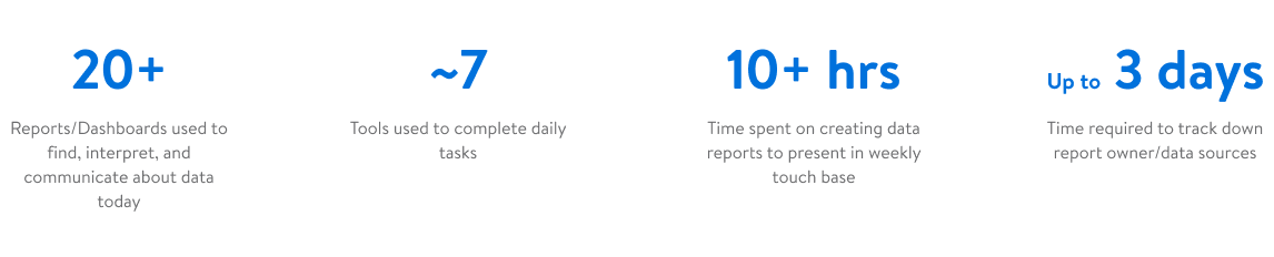
Teams were bouncing across too many dashboards and tools, sinking hours into reports and waiting in long queues just to track down the right data owner
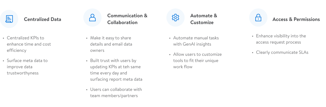
What users wanted was simple: easier access, centralized reports, smarter automation, and reliable metadata they could trust
02
Early concepts were structured around a tiered experience model (L1–L4), designed to surface the right level of data fidelity to the right user at the right time. We began with mid-fidelity prototypes in Figma, guided by two major questions:
1. How do we support fast KPI scanning and deeper exploration?
2. Can we design this system to scale across multiple report types and user roles?
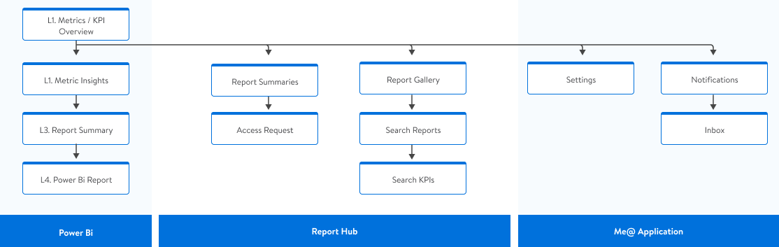
Before designing any screens, we needed a clearer pic of the infrastructure and data layers our app would be consuming, and a clear flow of where features would live
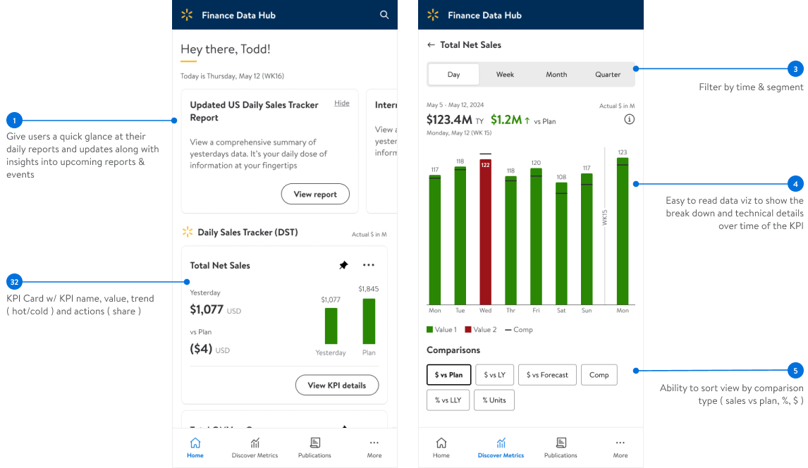
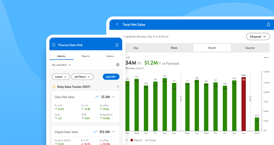
Early exploration was focused on keeping familiar branding and tone with other financial apps we used, while clearly calling out at a high level key KPI metrics, trends, and deeper drill downs into the data with time and channel sensitive slicers
We tested the prototype with ten users, and all of them were able to complete the core tasks without coaching — a solid validation of the flow. The feedback was clear though: the ‘daily news’ added no value, and KPI cards were eating space without showing relative context like year-over-year or sales vs. plan
03
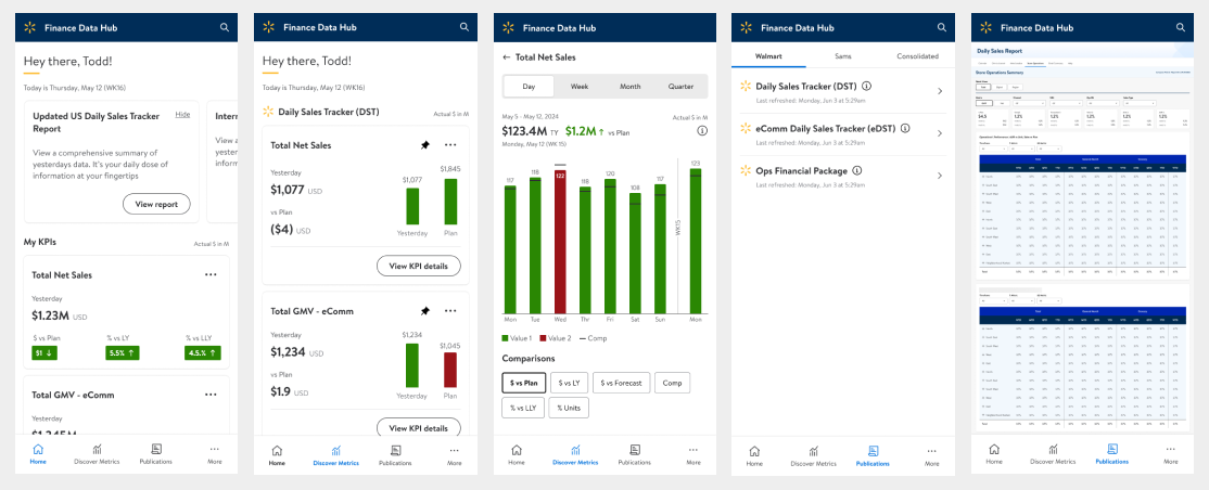
The refined build focused on turning our low-fi concepts into usable flows that actually carried weight day to day. L1 became a true dashboard of KPIs, not just cards on a grid — filters, comparisons, and context baked right in. L2 pulled those KPIs apart into deeper views with supporting charts and explanations, giving analysts and directors something actionable instead of just numbers
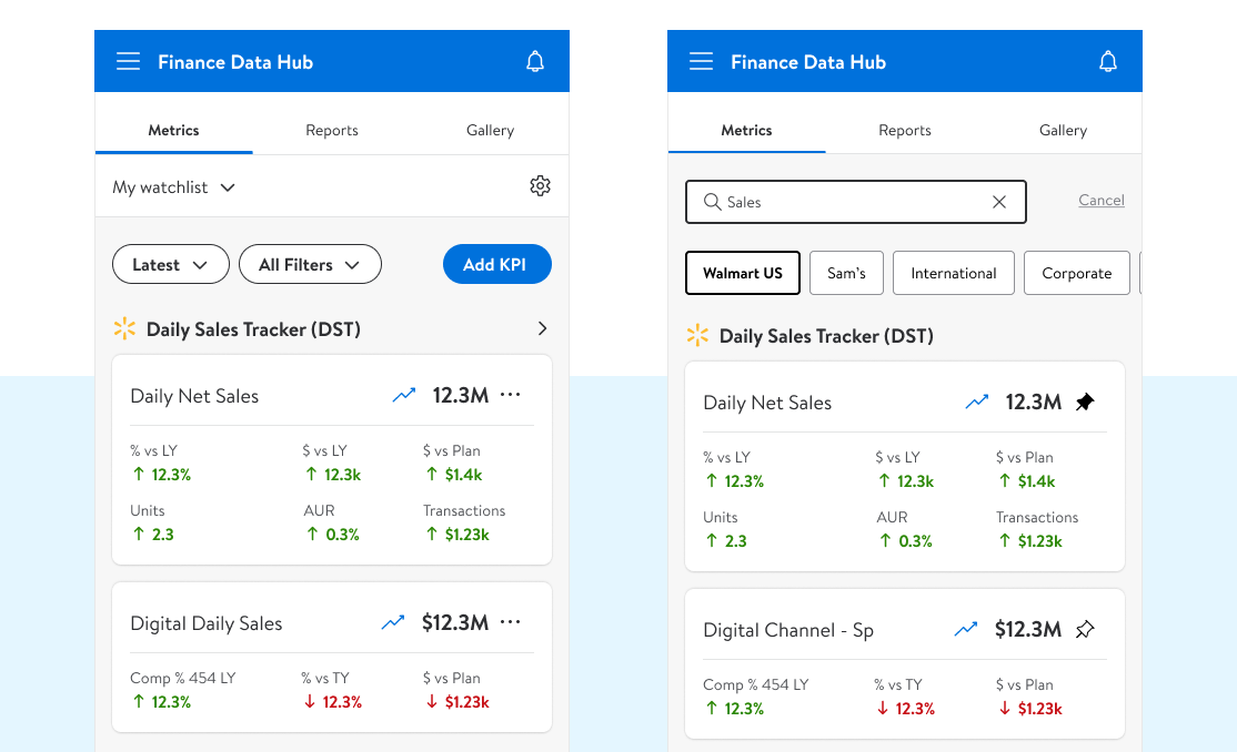
The “find KPI” flow closed a long-standing gap, letting users quickly locate the metrics they cared about and pin or request access without chasing down data owners
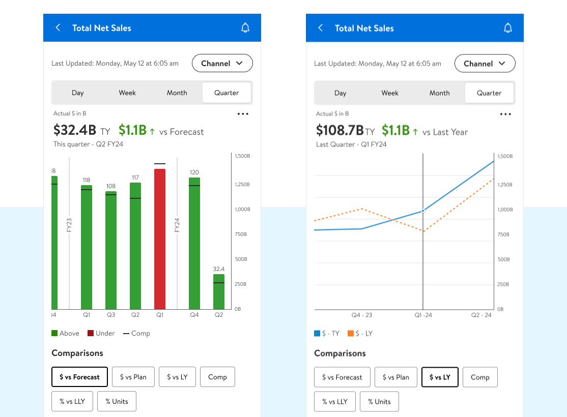
L2 unpacked each KPI into depth — timeframes, channel-level breakdowns, and comparison views supported with focused data visualizations. It gave analysts context they couldn’t get from raw numbers alone, making it easier to spot trends, explain movement, and tie KPIs back to real business outcomes
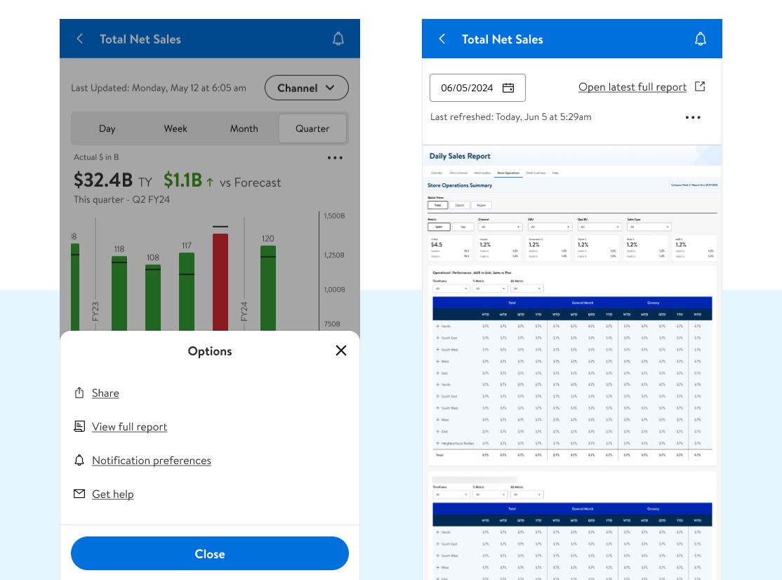
L2 made it easy to dive deeper — one step and you were in the full L4 report with the source data intact. Time frame filtering let you see previous report summaries, and for users who lived in Power Bi, we gave them a direct link out to the report
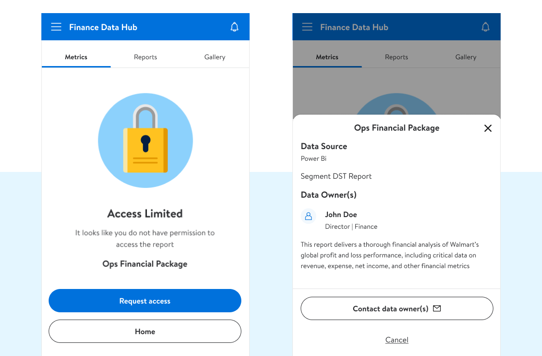
We cut through the old access bottlenecks — users could see who owned a report, request entry, or contact the owner directly instead of waiting in long queues
04
We succesfully built FDH to simplify the reporting mess: a tiered KPI system (L1–L4) that scaled from high-level dashboards to full reports, with flexible filters and comparisons baked in, with platforms in mobile-native, tablet and web.
05
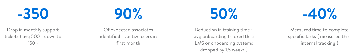
The dev team crushed it — super collaborative, fast, and honestly made handoff painless. On the business side we had to juggle inputs from channel leads, segment leadership, and a rotating cast of SMEs, which was a grind at times but made the final product sharper. From idea to a hard MVP launch in the me@ global app in under eight months was no small feat, and leadership was fired up when it shipped.
Our success here helped lead directly into the call for AI enablement - which you can read about here 😉