
Project Overview
Barclays is a British multinational investment bank offering business and consumer financial services. Our iOS application had just launched, and we needed to create an ipad specific version to meet our users personal and business banking needs
Our iOS - iPhone app had just launched to pretty good reviews. We wanted to build an iPad application that didn’t just match the mobile 1:1, but took advantage of the extra real estate offered by the tablet, as well as building on what we learned from launching the mobile version. We also had a ‘now or never’ chance to update the UI based on the just released iOS7 update, moving into a flatter, more user friendly & accessible brand design
I was the primary UX asset on the team, working directly with engineering and product teams to help design, test, and ship our app
01
Shortly after Apples WDC, I was on a plane heading to our HQ in Manchester/London for a 2 week, top to bottom redesign of our iOS design language. We quickly broke out the pen & paper, fired up photoshop, & pushed out not only a detailed, high level styleguide, with an emphasis on a more usable, clean design, and more attention to DDA ( accessibility ) compliance. Font sizes, colors, contrast, iconography - everything needed to be redone or brought up to date with current brand standards
The chance for a redesign allowed us not only the chance to freshen up the design, but to bring everything into spec. We were able to clean up file size and bring a consistent, uniform UI into the app, building a library of components, colors, spacing and iconography
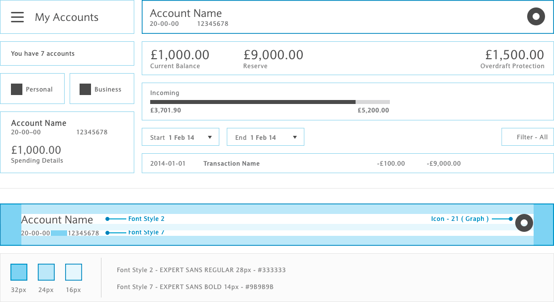
Working closely with the development team, we broke every page into components, & built a very detailed, reusable library. Breaking each page into separate components took some time to start, but once completed, new pages & flows were effortless & consistent
02
Thru one on one interviews, reading reviews, market & competitive research, we were able to come up with a list of what users needed, what their pain points were, and what they liked in our mobile app. The biggest take away was - UK banking is quite a bit more complicated that what we were used to in the US
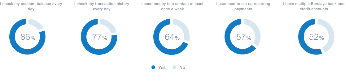
User surveys helped us determine what features were preferred and used the most, as well as which ones were necessary but less prominent
Mapping out user journeys helped us figure out what screens would need to be built, and what the different success / error scenarious would be before we starting building out low fidelity wires
Low Fi and mapping out the user journeys
03
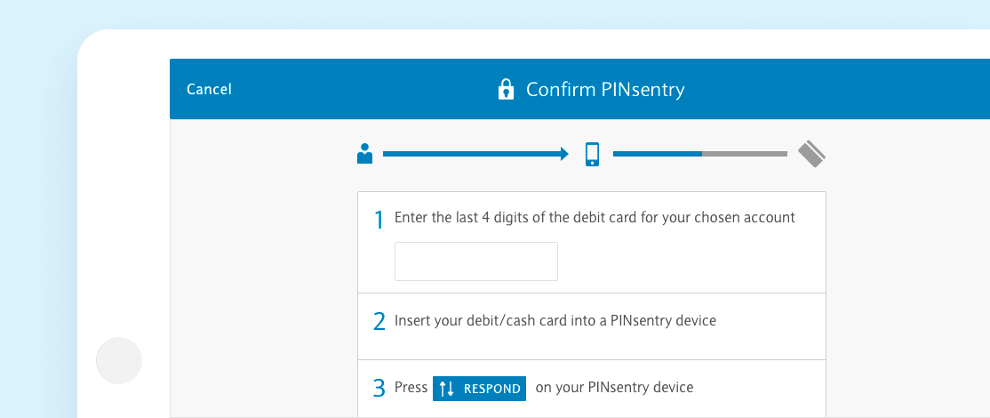
Registration was a tedious process in the UK. Onboarding required a minimum of 11 input fields & verification, a passcode, & an offline process where the user either went to an ATM or requested SMS verification as a 2nd factor of authentication
This was one of our users biggest pain points, and unfortunately half the journey took place outside our application
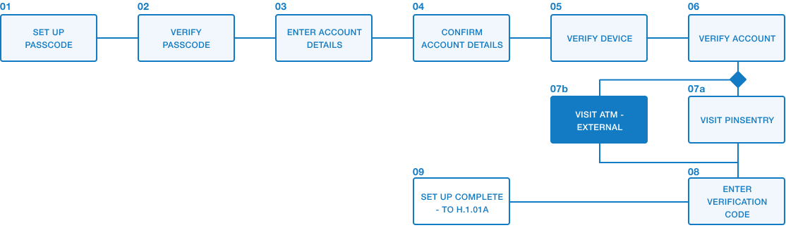
Mapping out the onboarding process
We used a progress tracker to break the steps into a more tangible process, a pattern that during testing was met with an overwhelmingly positive response. New customers didn't have to guess as to how much further they had to go, & perceived ‘pain’ was rated as low ( average of 2.6 on a 1-10 scale ) during testing & interviews
04
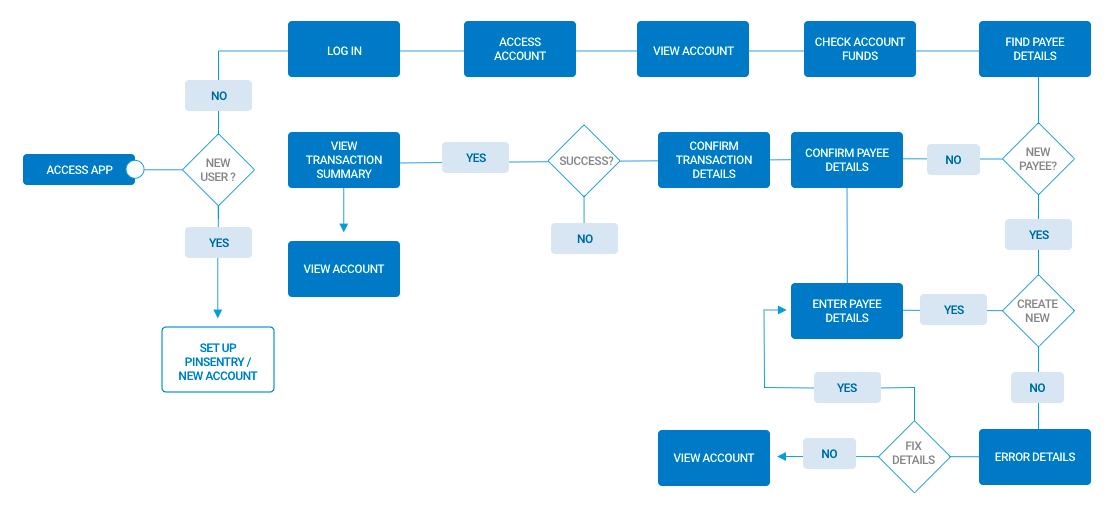
With over 32 user journeys starting from the main navigation alone, the app always risked feeling bloated & overwhelming. Adding in the dual personal/business functionality, the fact that a majority of our users had multiple checking/banking/savings accounts, mortgages & even loans, we had to be very careful to highlight the top services offered while not burying the less used but still important features
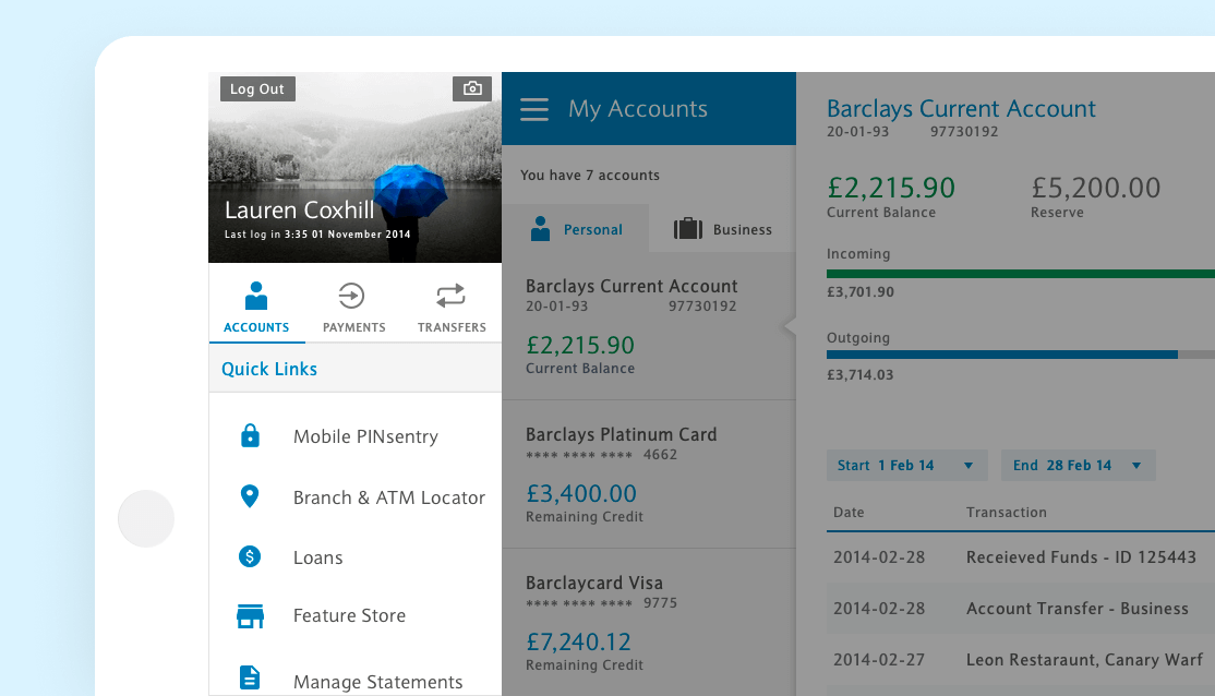
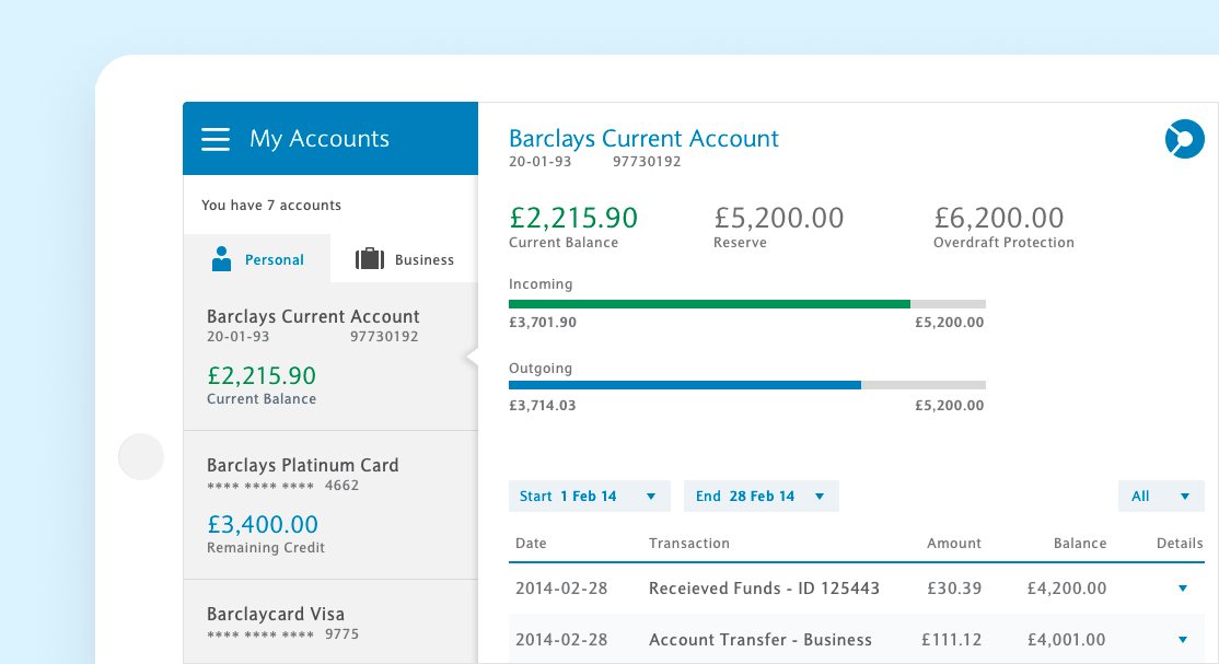
Account overviews, payments, & fund transfers were our top 3 used features, & were placed prominently on our home navigation. As multiple users would be on the same device, we also added personal customization so account holders knew at a glance who was logged in
Primary & account navigation - Our primary navigation held most of the top level functionality, from sending & receiving payments, to loan management, additional banking features, & security services. Account navigation allowed users to toggle between personal & business account
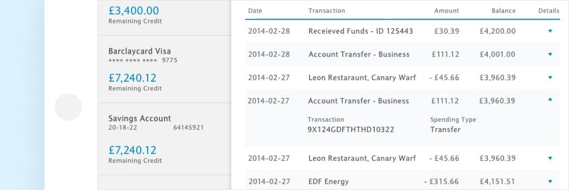
Transaction details were expandable per user request - a feature we didn't have originally on mobile that was frequently requested and easily implemented
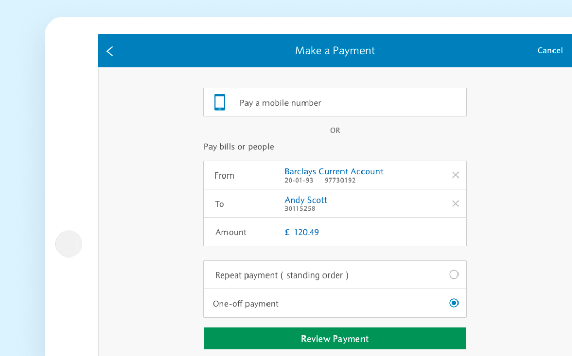
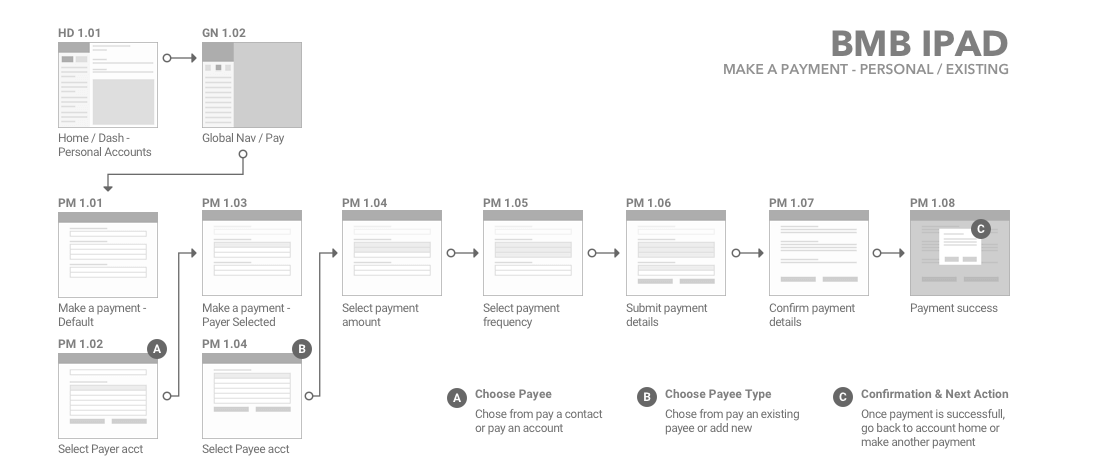
Being a banking app, one of our biggest features was - you guessed it - making payments. We allowed users to pay from any of their various accounts to pre-existing contacts, new contacts, or users by cell number ( if they banked with Barclays ). We also allowed them to set up and make recurring payments for spending such as monthly bills
The End
This was my first real enterprise level project, & was a tremendous learning experience. While I started work on this project prior to iOS7’s release, after Apples 2013 WWDC I had the chance to spend time at both Barclays Manchester & London locations, working with some of the most passionate & innovative project managers, developers, engineers, & digital designers. The level of attention given to brand, usability compliance, & customer satisfaction was impressive
We cut file download size nearly in half - primarily thru better asset compression, replacing images with drawables/hard coded assets where available, & removing clutter that had accumulated thru legacy development. BMB iPad had an over 4.5 star rating on the iTunes store while I worked on the project - given that this was a banking application, where a bad user experience was usually the only user experience that drew the time to rate the app, this was remarkable
Finally, while I was thrilled to be able to meaningfully contribute to such a massive project, none of this would have been possible without the amazing developers I worked with.
Users did not understand why the legacy app was being sunset, and did not want to move
We found out our - professional services team was doing a bulk of the data entry for our customers, which was not going to be an option going forward
Early users found it difficult/unclear when importing data into the new web app
Our application was slow
Users were stuck staring at a single page for long periods of time waiting for data to process